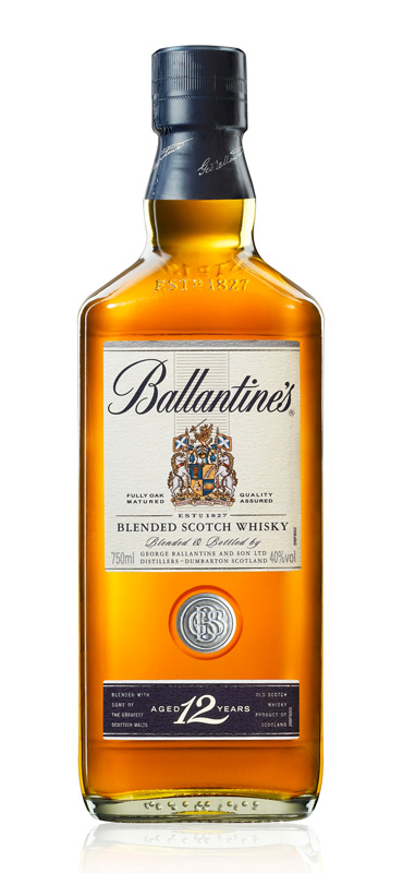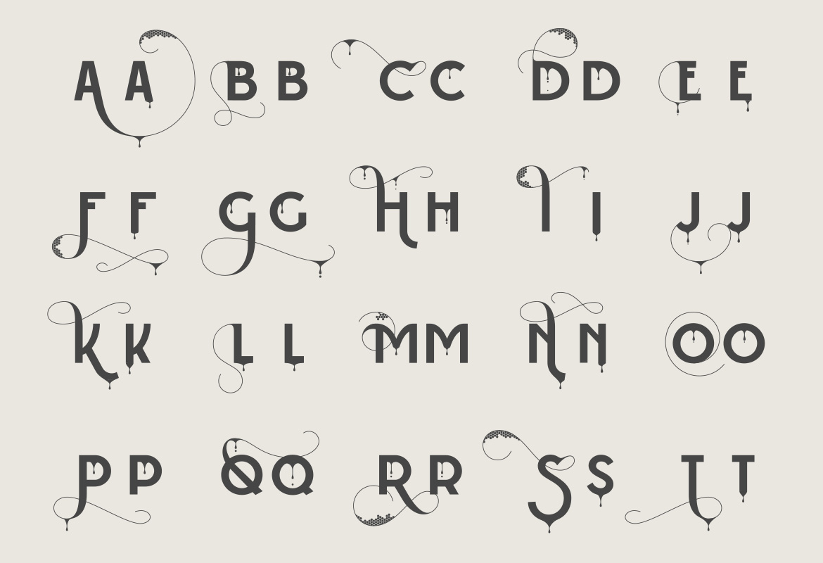
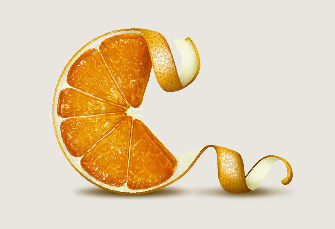

BALLANTINES SCOTCH WHISKY
Agency: Work Club, London
Awards: Communication Arts Award of Excellence,
CQ Professional Illustration Awards
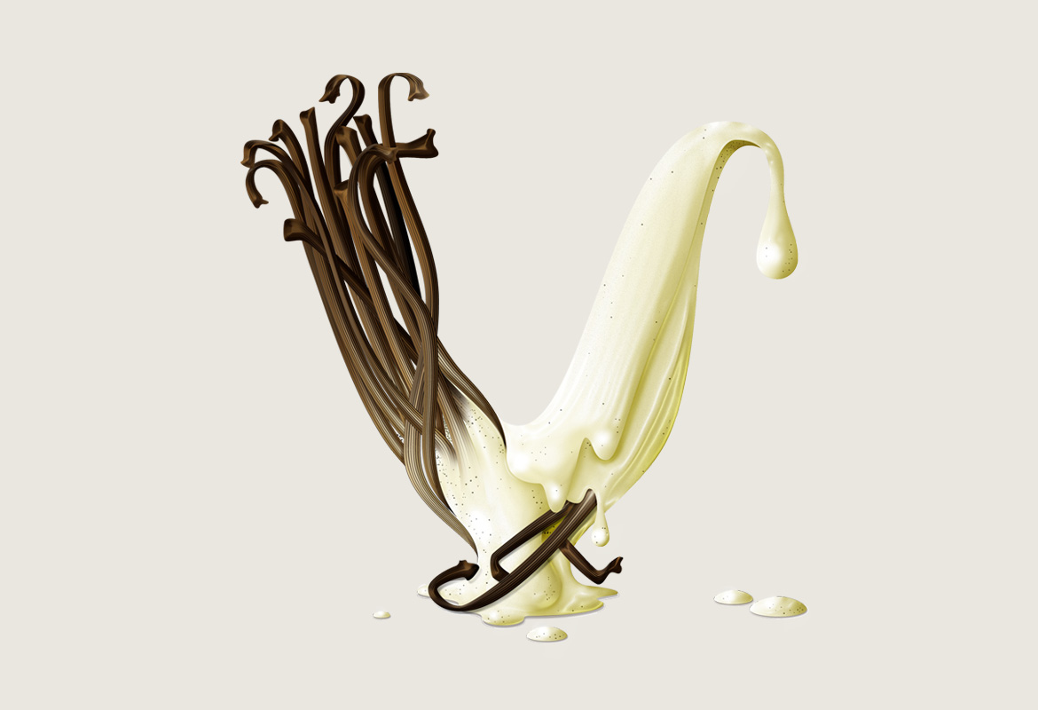
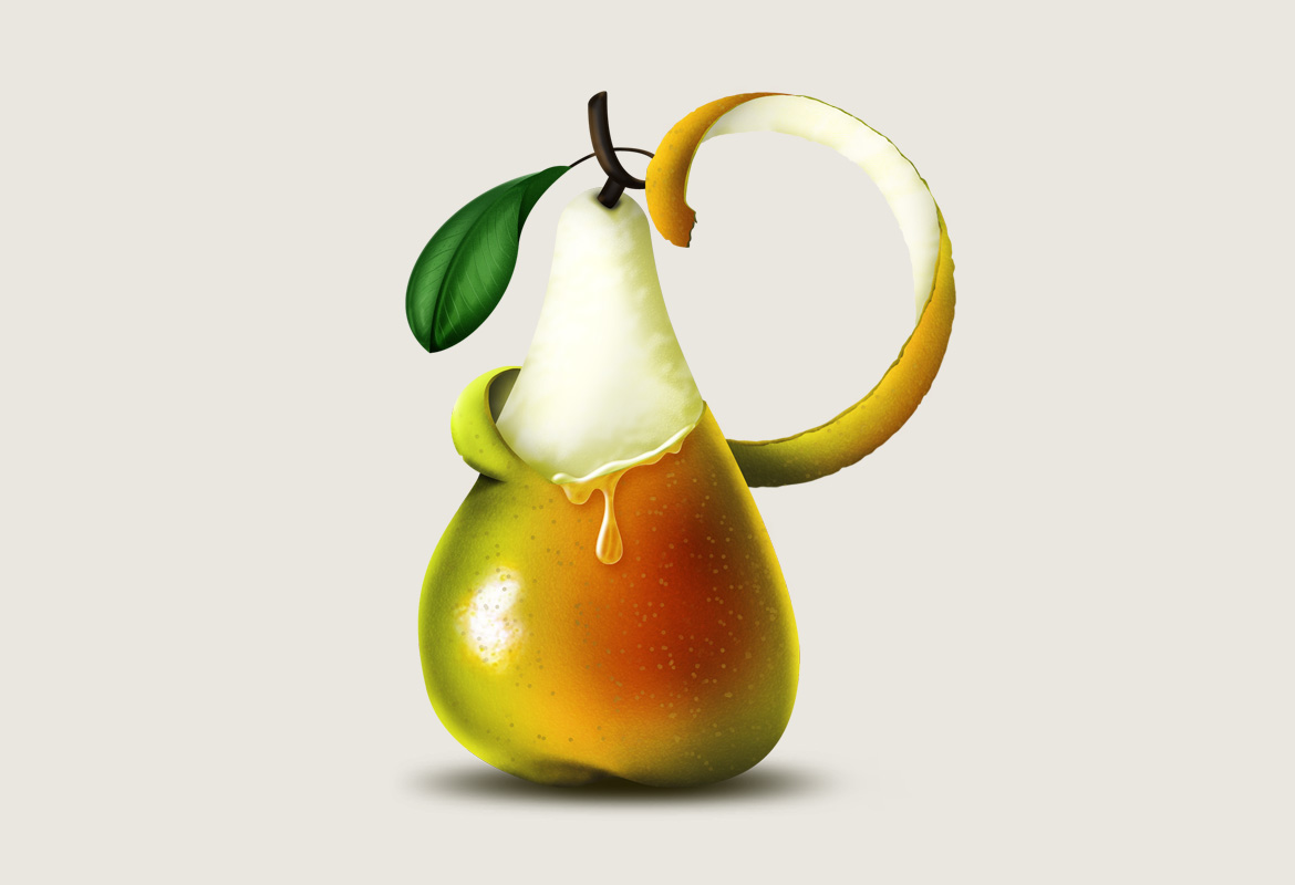
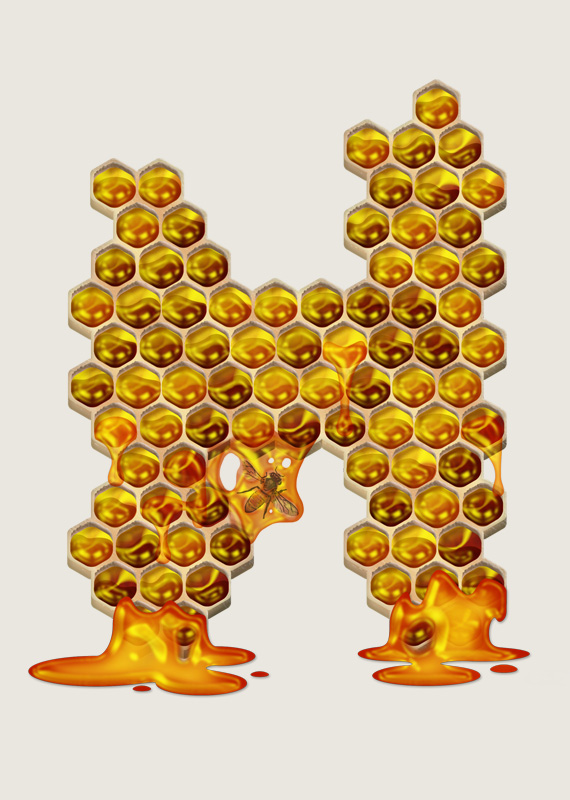
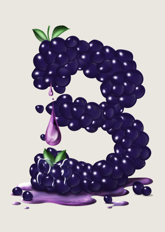
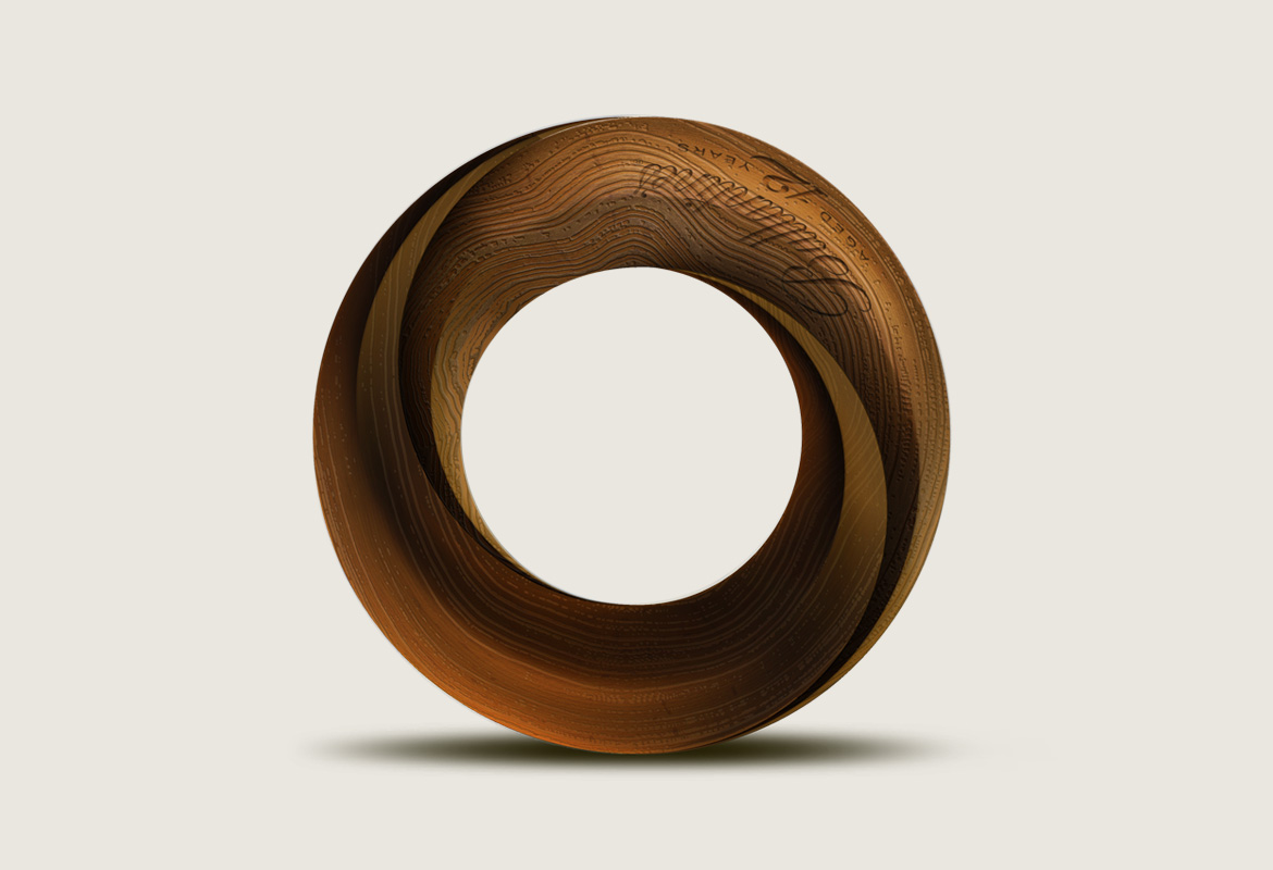
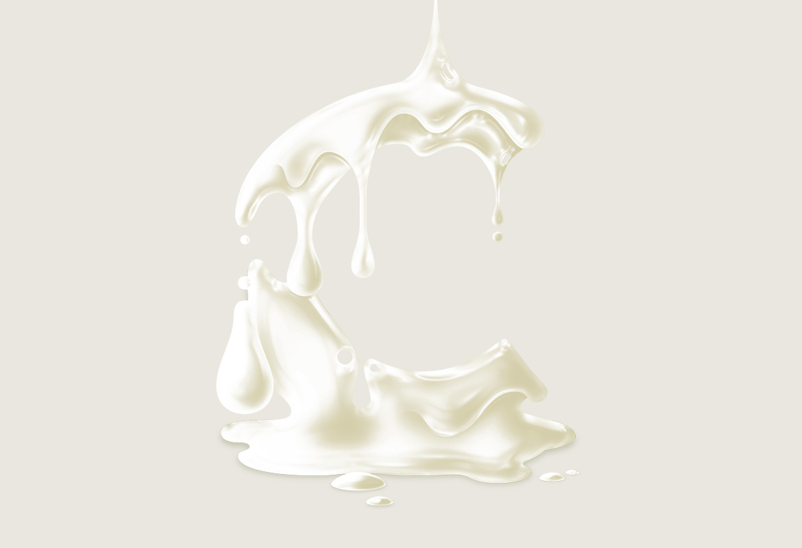
A series of illustrative drop caps created for an online campaign for Ballantines 12 year old Scotch Whisky. The concept was based around conveying the properties of each tasting note in the whisky by drawing each letter expressively and reflecting an individual note each time. Working in this way, C was formed from a section of a clementine, H became a dripping honeycomb husk, and O was created from a mobius circle of shining hardwood. In all, seven illustrations were made (along with extras for foreign language iterations).
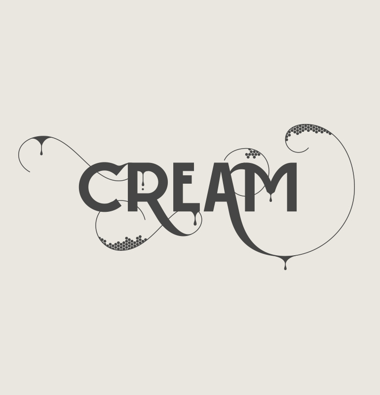
Additionally, a custom display typeface was created to embody each tasting note and add a sense of the blending process of the whisky itself.
Note: the typeface shown here is not the final version in use.